Avatars
An avatar is a graphical representation of a user or the user's character or persona.
Images avatars
Add the classes to make your Images as an avatar, for diffrent size of avatars use diffrent classes.Avilable sizes :- avatar-big , avatar-mid , avatar-sml. You can also copy the below code snippet.
Text avatars
For text based avatars, use avatar-txt class along with others. You can use diffrent classes for diffrent sizes.
RS
RS
RS
Alerts
Alerts are used to attract user's attention for important information without interrupting the user's flow.
Alerts without close button
You can use alerts class to create an alert. Use alert-pri, alert-suc, alert-war, alert-dan for diffrent types of alerts. You can use diffrent style classes for diffrent stylling.
This is a Primary alert.
This is a Success alert.
This is a Warning alert.
This is a Danger alert.
Badges
Badges are used to show user current status, or notification counts.
Examples of badges on avatars
Use badge-avatar class for a badges on avatars. We have three type of avatar badges in three diffrent sizes. Use badge-online, badge-offline, or badge-dnd classes as per your need. You can also use diffrent sizes by using badge-big, badge-mid, or badge-sml classes.
Examples of badges on icons
Use bagde__sec-text class for text badges. You can also copy the code snippet as it is.
Cards
Cards are used to show a brief detalis about something. It can be a user or a product or something else.
Examples of Vertical Cards
For a Vertical card use card and card__vertical classes along with others like center__flex and padding-1rem for other stylings. You can also copy the below code snippet. To add badges on the card use card__badge class and include badge in the code.
T-Shirt
₹ 500

T-Shirt
₹ 500
Examples of Horizontal Cards
For a Horizontal card use card__horizontal class with card class, or copy the below code snippet as it is. For a shadow use card__shadow class.

Round Neck T-Shirt
₹ 500
1000
50% Off
Examples of Text only and dismiss Card
For a text only card use card__textonly and if you want to include dismiss button use card__dismiss class.
Text only card
Normal card here
Lorem ipsum dolor sit amet consectetur, adipisicing elit. Eveniet perspiciatis illo perferendis distinctio laboriosam animi omnis aperiam quisquam suscipit atque.
Text only card
With dismiss button
Lorem ipsum dolor sit amet consectetur, adipisicing elit. Eveniet perspiciatis illo perferendis distinctio laboriosam animi omnis aperiam quisquam suscipit atque.
Examples of Text Overlay Cards
Text overlay cards are used to show additional information of a product. You can use card__textover calss. For new Arrivals card use new-arr class in overlay__sec-text and for Out of Stock card use oss class.

T-Shirt
₹ 500

T-Shirt
₹ 500
Examples of New Arrival Horizontal Card.
For a new arrival horizontal card use card__newarrival class or copy the below code snippet.

Summer collection
Lorem ipsum dolor sit amet consectetur adipisicing elit. Quisquam, consequuntur!
Examples of E-Commerce Product Card.
For a E-Commerce product card use card__e-commerce class or copy the below code snippet.

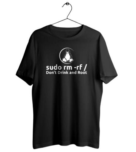
Don't Drink and Root
Unisex T-Shirt
₹ 1000
₹ 500
Images
Images can be responsive to fit their parent element full width.
Examples of responsive images
To make an image responsive use the image__res class and to make that image round just add border__rad-full class.

Inputs
Inputs are used to take information from users.
Examples of Textarea input
To use textarea as an input use input-textarea class and to make it non-resizable use no-resize class.
Examples of Input with validation error
To use a from with Validation and error styling use input-validation class in your form.
Text-Utilities
We have some pre defined text style classes to style your texts.
Examples of Heading texts
For headings you can use h1, h2, h3, h4, h5, h6 classes.
Heading H2
Heading H3
Heading H4
Heading H5
Heading H6
Examples of small and grey texts
For headings you can use h1, h2, h3, h4, h5, h6 classes.
Small text here.
Grey text here
Left aligned text here
Centered aligned text here
Right aligned text here
Lists
List are used to show some information in a structured way.
Examples of Normal lists
We have for type of normal list. Use list-num, list-cir, list-disc, list-hand classes to use them. If you want to reverse the order just add reverse attribute too.
- Item 1
- Item 2
- Item 3
- Item 4
- Item 5
- Item 1
- Item 2
- Item 3
- Item 4
- Item 5
- Item 1
- Item 2
- Item 3
- Item 4
- Item 5
- Item 1
- Item 2
- Item 3
- Item 4
- Item 5
Examples of Stacked lists
To make a list stacked list use list-stacked class, or copy the below code snippet as it is.
-
SI
Stacked Item 1
Lorem ipsum dolor sit amet consectetur adipisicing elit. Tempora, voluptas!
-
SI
Stacked Item 2
Lorem ipsum dolor sit amet consectetur adipisicing elit. Tempora, voluptas!
-
SI
Stacked Item 3
Lorem ipsum dolor sit amet consectetur adipisicing elit. Tempora, voluptas!
Modal
Modal are used to grab the user attention and show some important information.
Example of Modal
We have a basic modal with save, close and dismiss button. You can copy the below code snippet to use that. To make it functional just toggle modal-active class in modal__box section.
Modal title here
Rating
Rating components are used to show customer satisfaction with the product or service.
Example of Rating
We have a basic rating component here. To make it filled add fas class in the i element.
Toasts
A toast provides simple feedback about an operation in a small popup.
Example of Toast
We have two type of toast here, You can use them and to make them functional just toggle toast-active class in the toast-box section.
Added to Cart
Removed from wishlist
Grids
Grids are used to make complex designs easily.
Example of 50:50 grid layout
To use 50:50 grid layout add grid and gird-50-50-col classes in the wrapper.
50% Left section
50% Right section
Example of 70:30 grid layout
To use 70:30 grid layout add grid and gird-70-30-col classes in the wrapper.
70% Left section
30% Right section
Example of 4 columns grid layout
To use 4 columns grid layout add grid and gird-4-col classes in the wrapper.
1st Column
2nd Column
3rd Column
4th Column
Slider
Sliders are used to select a range.
Example of Slider
To use to below slider add the slider__box class in the wrapper box or use the below code snippet.